welcome to fatima's portfoliooooo!
What are you here for?

Wind Chimes Games - NDA

Afterparty pause screen rework

Terminator Line - exploratory AR/ceramics

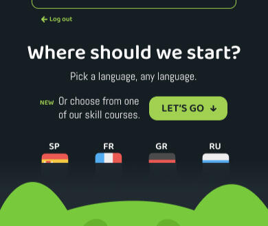
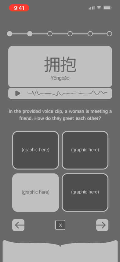
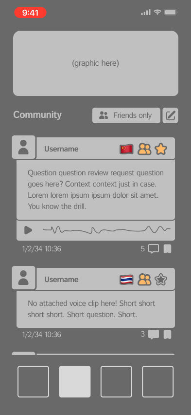
Language-learning platform concept
Duolingo onboarding rework

BG3/PoE UX research - coming soon !


Exercise - Valorant modal concept

Exercise - iOS boarding pass concept

Exercise - Codecademy pricing rework


Ongoing work for indie visual novel developer, Wind Chimes Games.Can't share too much until official announcement, but was permitted to display the following screens (with appropriate censorship); enjoy, and keep an eye out for the title to drop!

Quickswap 1

Quickswap 2

Missions

Save/load


Revamping the minimal UX of Night School Studio's adventure sidescroller, Afterparty.Inspired by personal critiques during my first playthrough, and expanded both for immersion and visual charm.

Reworked pause screen

Introduction / the issue
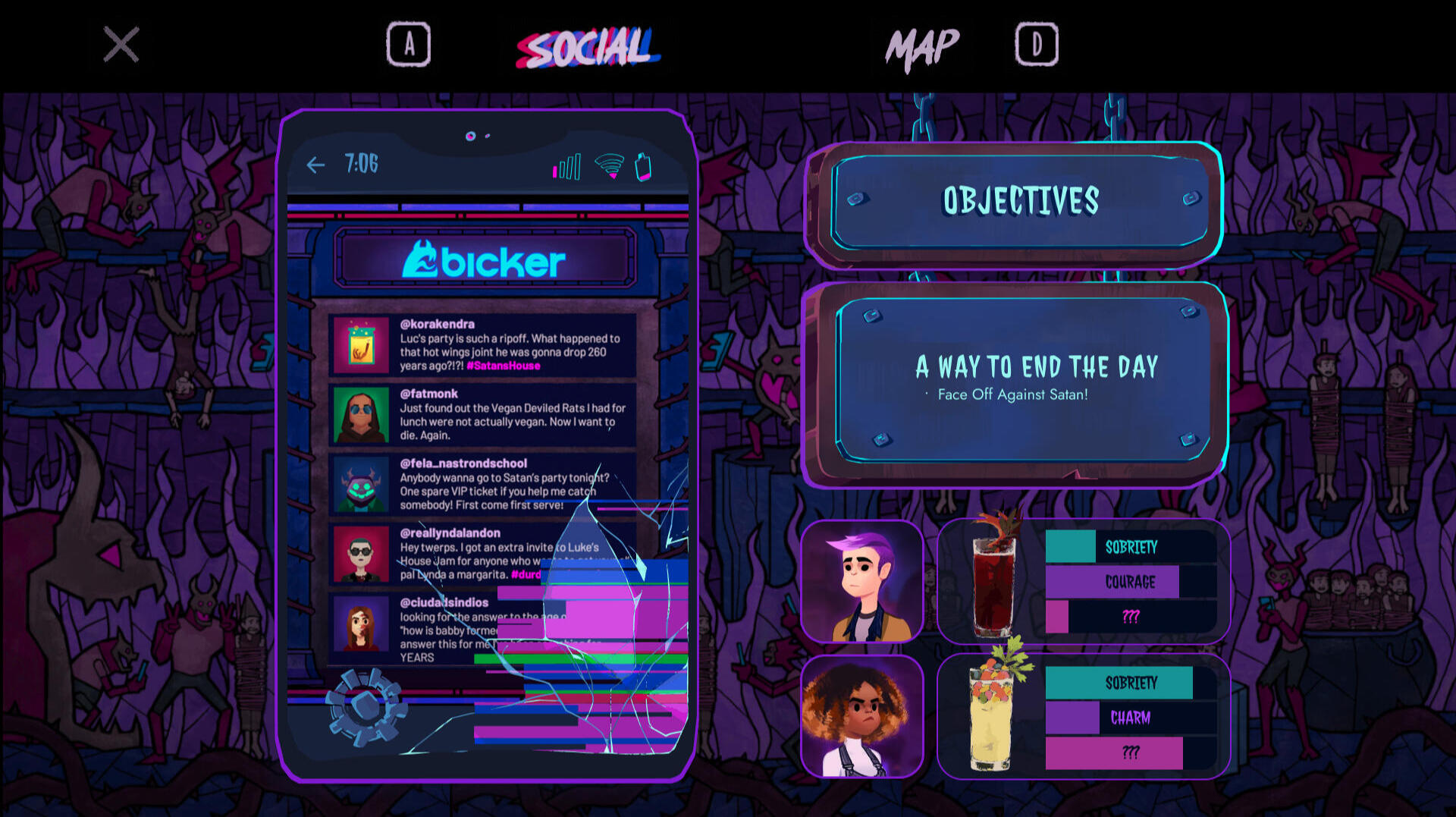
Night School Studio's third title, Afterparty, is a walk-and-talk sidescroller following two characters, Milo and Lola, as they try to gatecrash and subsequently drink their way out of hell. It's reminiscent of its precursor Oxenfree, but where Oxenfree shines, both in replayability and design, Afterparty falls just short.Like Oxenfree, Afterparty's relatively minimal. There's no real HUD, and the only real screens aside from active gameplay and the settings menu are the pause menu and its subsections; in Afterparty''s case, this would be the map, photo album, and its one real deviation from Oxenfree's design standard— Bicker, Hell's equivalent of Twitter.

In-game pause screen - Social

In-game pause screen - Map

In-game pause screen - Photos


Bicker takes up the majority of the pause screen. It's what the player loads in to by default upon hitting tab, and as the live game stands, it's... kind of underwhelming!, both compositionally and in terms of information provided to the player. Bicker is fun, sure, but it's not gameplay-relevant enough to warrant its own dedicated screen with no other real usage of the space around it, especially when other features— like the questlog and player decision records (mostly depicted in-game as text messages)— are either hidden (such as the questlog behind layers of map interaction) or don't make a player-accessible appearance at all.The objective here is mainly to fulfill these three goals:1. To restructure the pause screen to make better use of space, both compositionally and in terms of usefulness,2. to give the player a visual reference for core gameplay-related information (including, but not limited to, both a more immediately locatable objective list and some way to track dialogue option deviations based on whichever behavior-modifying drinks they have Milo and Lola down), and3. to give Afterparty's UI a bit more of that distinct, engaging character that exists within the visuals and atmosphere established in-game.

Bicker rework

Photos rework

Reworked pause screen - overview

Initial thoughts


conclusions
The composition went through quite a few (extremely) low-fidelity iterations before I landed on what's embedded above. Included are the objective list, a kind of status-bar format to reference which drinks the player chose, as well as visual cues for both the remaining duration and hints as to how, exactly, Milo and Lola's dialogue options are changed depending on what they've drank. To the left is a phone— stylized with cracks and dead pixels, because let's be real, nobody's getting a decent phone in Hell— from which the player can access Bicker, their past messages, and their camera roll.
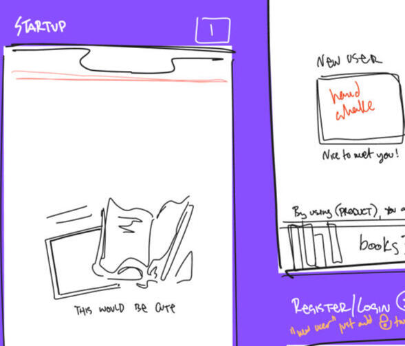
Ongoing product design project. Developing Codex, a language-learning app that teaches in a more natural style than the available market competitors (most notably Duolingo, but a couple of others which are mentioned by name later as well!)

A couple of initial thumbnails. The wireframes are cleaner, I promise.

Introduction / the issue
Language learning apps are the easiest point of access for a lot of people who otherwise just wouldn't have the resources to learn, and when they're actually usable without a subscription, they democratize education in a really impactful way.Unfortunately, a lot of the apps available on the market aren't usable, with or without a subscription (although the paywalling thing could be another page entirely). Many of them not only rely on rote memorization, they won't even immerse you in your target language! Even a cursory search will give you plenty of sources (for brevity's sake, I'll direct you to Cambridge, Education First, and the Center for Advanced Research on Language Acquisition) that all say generally the same thing: it's far harder to learn a new language in your native language than it is to dive headfirst.Beside all that technical stuff: this is an important educational barrier to address. Language acquisition can increase people’s neuroplasticity and empathy, and provide new channels for communication between demographics who otherwise would not have had the ability to connect. All good things, I'd say.

My big, messy research FigJam board.

Common themes between competitors.

More of those themes! Analysis galore.


So, how's about moving forward with finding a fix? I think that's a good idea. Let's do that.After all the research you see above... user personas (the three right below)! User flows! Tone of voice! Who's using this, and how should it look and feel to appeal to them, and work for them the best it can? As it turns out, I do have some solutions in mind.Codex is a language-learning product that prioritizes a naturalistic learning style for users hoping to learn or bolster proficiency in a second language, which will allow them to gain confidence and fluency by:> regular grammar and vocabulary lessons, including notes describing slang and nuance;
> immersing them in their target language with regular reading, listening, and speaking practice, whether that be through connection with native speakers or recommending media and literature produced in the learner’s target language;
> directing them to additional external resources to reduce paywall discouragement,through which they can continue to strengthen their linguistic skills.Think about it. Wouldn't you rather learn Italian culinary language by watching Italian cooking shows, documentaries, dubs of The Bear? Wouldn't you rather read Chinese novels to get a better grasp on Mandarin than be asked the same four vocab questions on loop?

Vikash, a business-driven learner.

Bituin, a culture-driven learner.

Bituin, a culture-driven learner.

There's those initials again.

The very beginnings of a design system.


Conclusions
Codex is a big one, and it's nowhere near finished. It was conceptualized and worked on over the duration of the Fall 2025 semester, and I'm still going — I've been thinking about paywall circumvention, of all things, how a streaming service partnership could get around the need for a subscription-based content distribution system and act as free marketing — but I'm pretty pleased with how it's turned out so far.
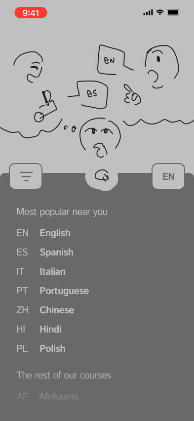
Pick a language, any language.
Best to cut out the mental translation step, isn't it?
Language is about communication! You gotta do it to learn!
Have you ever wanted to read the Odyssey in the original Greek? Me too. Me too.


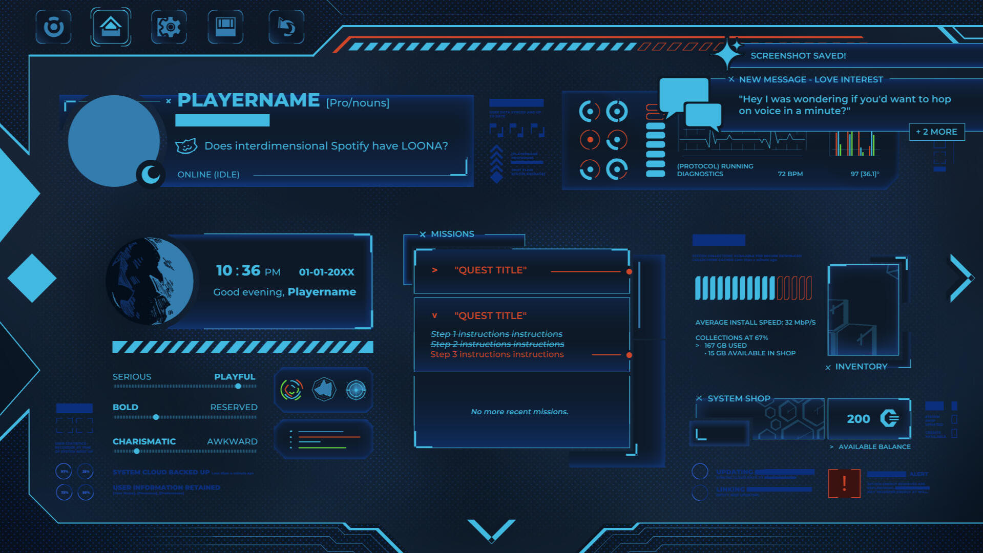
Terminator Line is an ongoing project examining the relationship between interface, illustration, and physical spaces, particularly in the context of video games and game design.

Welcome to The Tavern.

Introduction / the issue
Terminator Line was initially conceptualized as a recursive gameplay loop taking place within a limited number of interactable locations or spaces, and slowly morphed into a hybrid installation using both augmented reality interface design and ceramic art. One planned location— affectionately called the Plaza— was selected and broken down for both AR prototyping and physical construction using brown stoneware clay, in lieu of a traditional digital 3D or isometric model. (That'll be up here in a couple of weeks!)

Very first concept thumbnails.

The Tavern, refined sketch.

The Self, refined sketch.

The Monolith, refined sketch.


Speaking in all honesty: it got a bit out of hand. For one: scope creep! Terminator Line has been entirely self-directed, and as any passion project does, it kept growing until it became unmanageable, and until I had to put my foot down and set some hard parameters for myself.For another: I'd planned at first to use Adobe's AR platform Aero, only to find out it'd been discontinued a few months after I'd started formally working on the UI. Since then, I've been chipping away at solo learning Unity for UI implementation, and I've got Apple's platform Reality Composer on the backburner, just in case.Some objectives for this project:1. Experiment with mixed-media in UI, as a continued exploration extending from my graphic design days.2. Build a semi-solid basis for a future project, whether that be in visual style, a starting pool of items, a map of sorts, or basic mechanics.3. Learn some new software! Unity, I'm coming for you!

The Bloodhound's NPC profile.

The Huntsman, mid-conversation.

Rapport system overview.
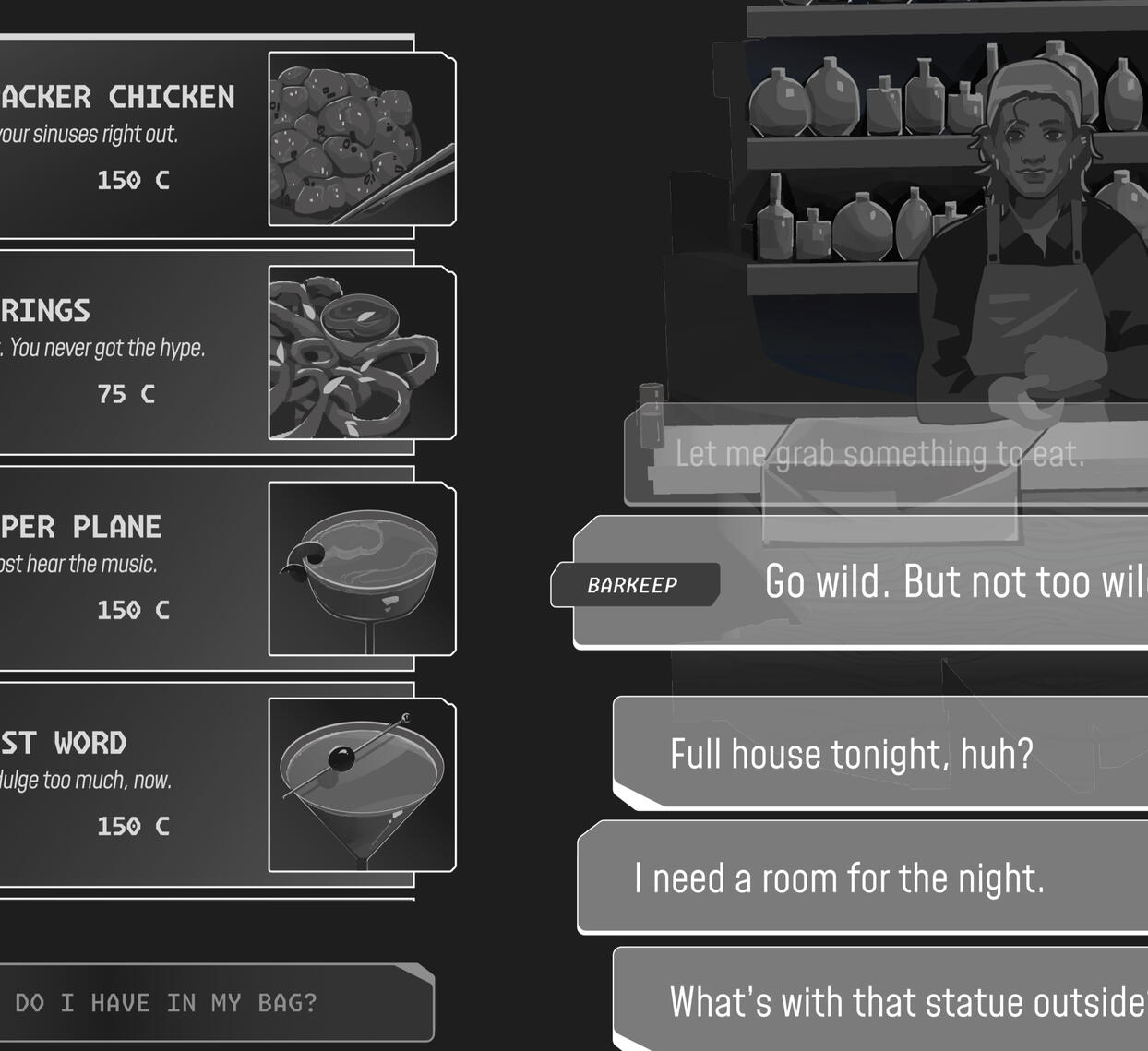
Tavern menu overview.

The Self, your pause screen.

The Monolith, an in-progress Save/Load screen.


Introduction / the issue
So: we're still going. One of the biggest challenges in working on this has been keeping myself in line and accountable without a team or client in the background to motivate me, because so much of my passion comes from working and creating things with other people. I've narrowed this iteration of Terminator Line down far enough to be feasible, though, and that's achievement enough for me (at least for right now); I'll tackle expansion when I come to it.Terminator Line draws heavy inspiration from a number of sources— the roguelike genre; Hades and Transistor, both by Supergiant Games, one of my favorite studios; cRPGS, including but not limited to ZA/UM's Disco Elysium, Toby Fox's Undertale, and MinMax Studios' in-development title MinMax; the filmwork I love, including but not limited to Fleabag, Russian Doll, Loving Vincent, and Mr. Plankton; and Infinite Fall's Night in the Woods, my favorite game of all time.Terminator Line is a story about perfectionism, guilt, and letting go. Terminator Line will, eventually, be a game about autonomy, passion, and moving on.
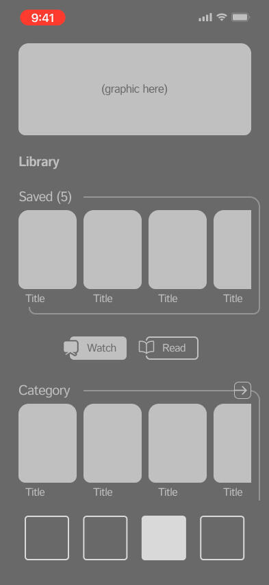
Completed as a proof-of-concept reoptimization of Duolingo’s onboarding process. Inspired by personal critiques and issues encountered regarding data loss and cloud backups (or lack thereof).
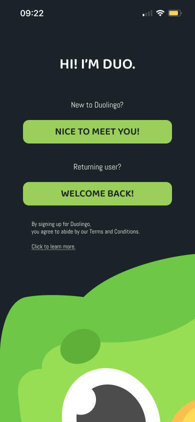
Rework - startup screen
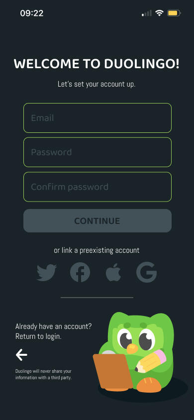
Rework - sign-up screen
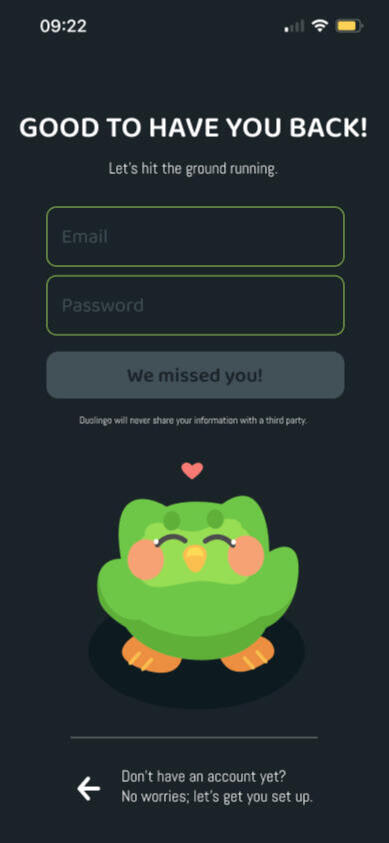
Rework - login screen


Introduction / the issue
Since its release in 2011, Duolingo has gone through quite a few UX changes, with the most notable (or, at least, the one that stuck out to me the most as an on-and-off user) being the switch from the Unit system to the Path system to the kind of middle ground that exists in-app today. However, as far as I'm aware, there haven't been any major revisions in the user flow. This shows most clearly to users like myself, whose relationship with Duolingo started off a bit rocky, in the onboarding flow.Duolingo's onboarding flow does a very efficient job of getting the user set up as quickly and easily as possible. What it doesn't do, though, is prompt its users to sign in or register for an account (at least, not from the get-go). Which isn't inherently bad! Accounting for an as-guest percentage of the userbase is far from a poor move. However, this flow fails to account for a key aspect of the user's long-term experience: progress retention.

In-app language selection
In-app prior experience

In-app priority selection

In-app course overview


As it stands (or stood, at the project's time of inception), Duolingo's entire onboarding process can be completed without ever linking or creating any account for data backup. This means that, in the event a user switches devices or wipes their hard disk— or, honestly, just deletes the app, with or without the intention of downloading it again later—, their existing progress, no matter how deep into the course, will be lost. Which, you know, isn't super ideal.The objectives for this redesign were as follows:1. To reconfigure the original account flow and prompt the user to link their progress upon initial launch, without sacrificing the existing immediate dive into learning,2. to streamline the interactive flow, and make it a little more visually interesting as opposed to the very minimalist, multi-page list-format composition that exists in-app, and3. to sharpen my illustrative UI skills a bit without straying too far outside of Duolingo's existing visual identity.

Rework - Profile

Rework - Course selection

Initial thumbnails


conclusions
Admittedly, this was a project where I knew from the jump which direction I wanted to go; while some aspects ended up changing as I worked (whether it be illustrative compositions or proportions, or the course selection rework after the official in-app addition of mathematics and music), the screens stayed largely faithful to my initial low-fidelity sketches.I think there's definitely potential to expand this redesign beyond just the sign-up/login screens— I'd like to try my hand at the entirety of the onboarding, honestly, course overviews and all—, but for now, I'm pretty satisfied with the product as it is.

Meet-Uncute (2026; IP)

GRWM (2025)

The Sacrifice (2023)

Cooking Lv. 10! (2022)

The Tavern - Sketchbook (2026)

Misfits in the Tavern - Sketchbook (2026)

Cocktails! - Sketchbook (2026)

Practicing with bar food - Sketchbook (2026)

Worms in my brain - Sketchbook (2025)

Quick background layouts - Sketchbook (2025)


This one's a placeholder. Stand by...

Hello!
I'm an Arab-American visual artist primarily interested in narrative-driven art, visual storytelling, and the things that make us human.I got into design primarily because of a love of visual storytelling. This was motivated further the more I got into gaming; the intersection of beautiful visuals and good, intuitive design became increasingly fascinating to me the more I consumed, and has become a huge passion of mine over the years, especially when it comes to accessibility reform in the realm of digital media.I believe that improving user experience and beautiful art should both complement and elevate each other. Good design should never come at the cost of quality of life, and it should never be the reason that someone can't access the art at all.I love birds, video games, and the color green. If you're interested in any of those things— or, hey, even if you're not!— feel free to contact me whenever.Resume available upon request.